Teddy’s Matcha
-
Playful, comforting, and full of personality, the branding for Teddy’s Matcha brings warmth and joy to the everyday matcha ritual.
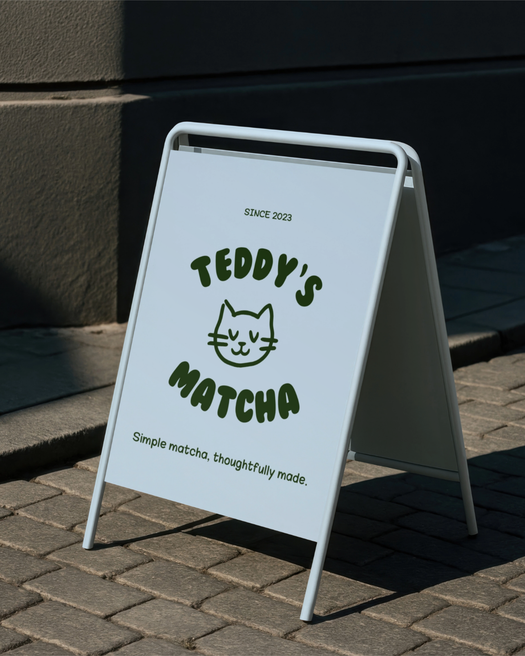
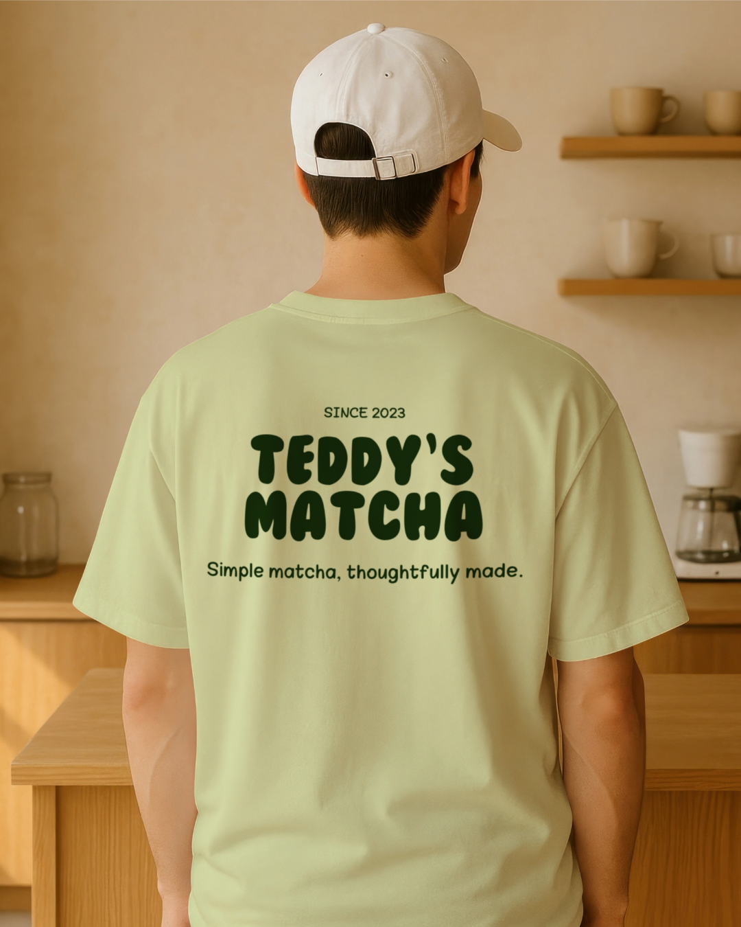
Inspired by Austine’s cat Teddy, the heart of the brand, the identity leans into a friendly mascot style paired with soft, calming tones that reflect the soothing nature of matcha. Rounded shapes, cheerful illustrations, and gentle colours create a brand that feels approachable, cozy, and memorable.
Every element was designed to make the brand feel like a small moment of happiness, inviting people to slow down, enjoy their matcha, and connect with the playful spirit behind Teddy’s Matcha.
-
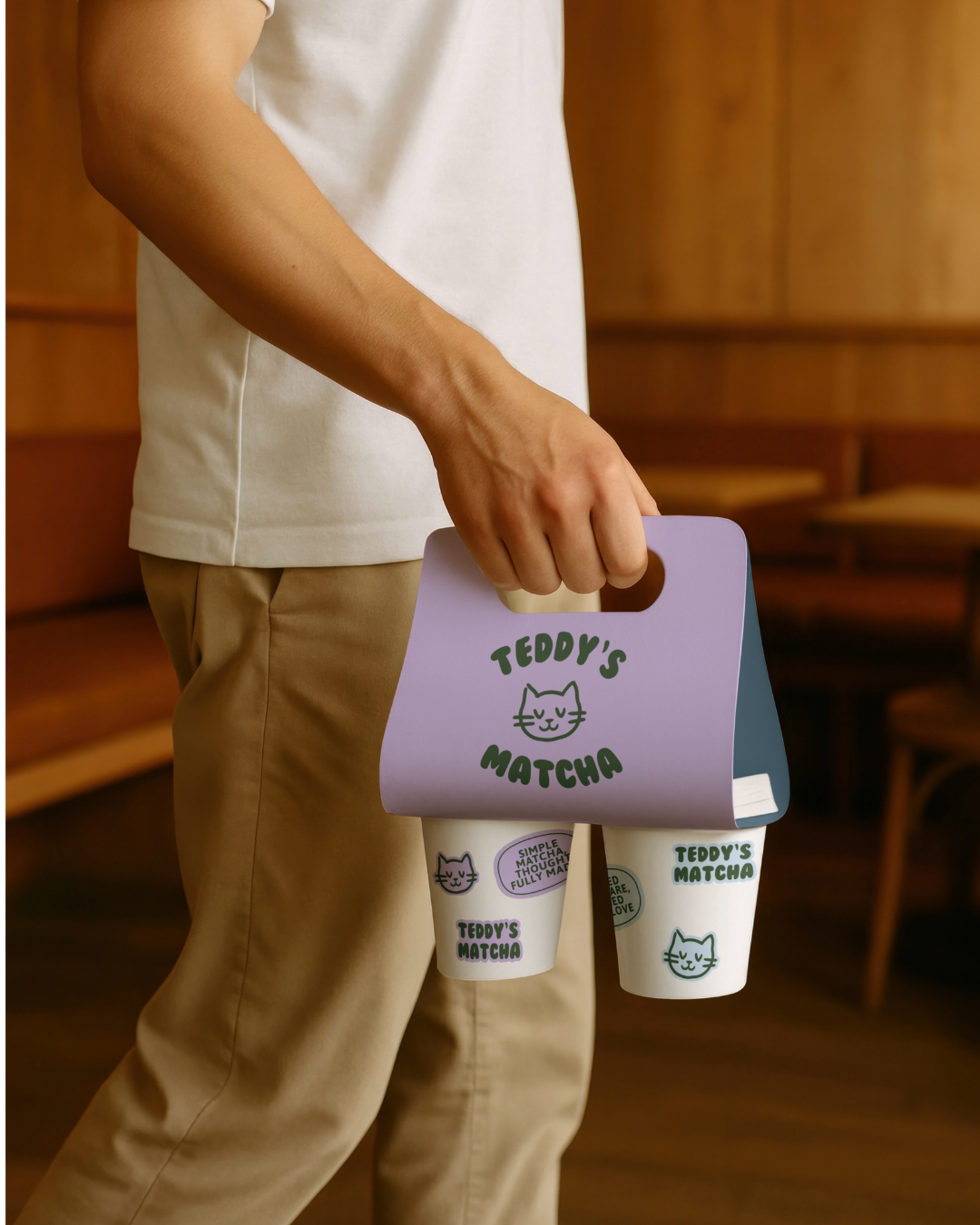
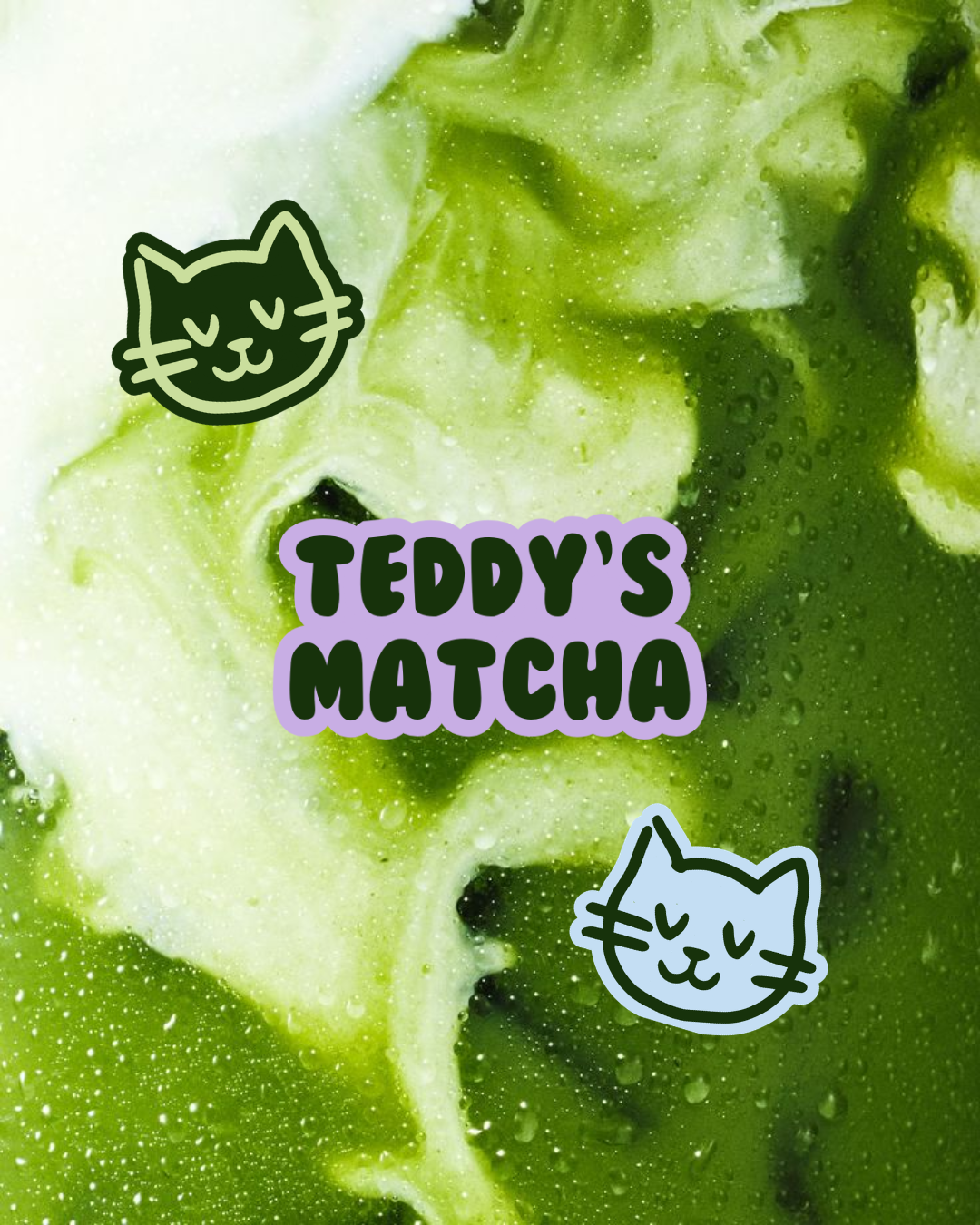
To strengthen the personality of Teddy’s Matcha, I recommended leaning into the mascot-driven identity and using Teddy as the central storytelling element across the brand. The illustration style can be expanded through playful icons, stickers, and small graphic elements to create a lively and recognisable brand world.
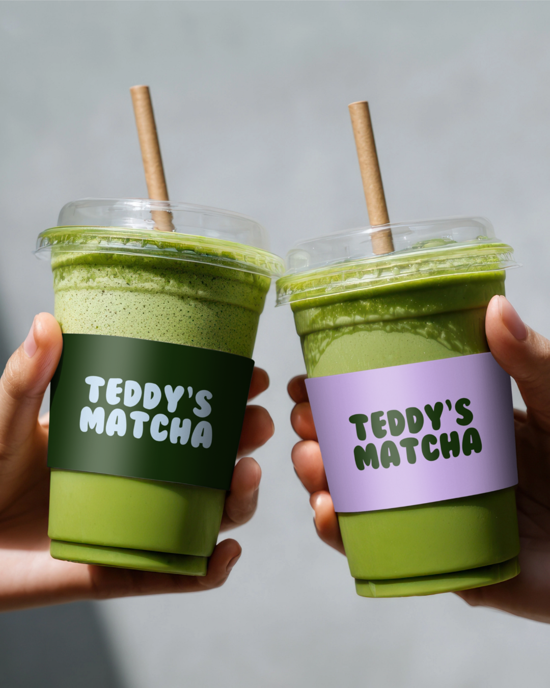
Using the soft matcha-inspired colour palette and rounded typography consistently across packaging, menus, social media, and in-store materials will help maintain a cohesive and welcoming atmosphere. I also suggested incorporating the character into seasonal content and limited packaging to keep the brand dynamic while reinforcing Teddy as the face of the experience.
-
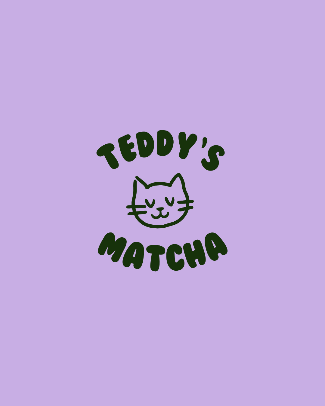
This project was completed as a custom Mini Branding Package, focused on creating a simple yet distinctive visual foundation for the brand.
The scope included the design of a primary logo, along with a carefully selected colour palette inspired by soft matcha tones and a font pairing that reflects the playful and friendly personality of the brand.
While intentionally minimal, these core elements provide Teddy’s Matcha with a clear and recognisable identity, ready to be applied across digital platforms and future brand touchpoints.
-
As this project was completed as a custom Mini Branding Package, it did not include additional deliverables such as secondary logos, icon sets, brand guidelines, social media templates, packaging design, or website development.
The focus of this package was to establish a clear and recognisable visual foundation through the primary logo, colour palette, and typography system.
Additional brand assets, such as illustrated icons, expanded logo variations, packaging design, or social media templates can be developed as optional extensions as the brand continues to grow.