Up The Anti
-
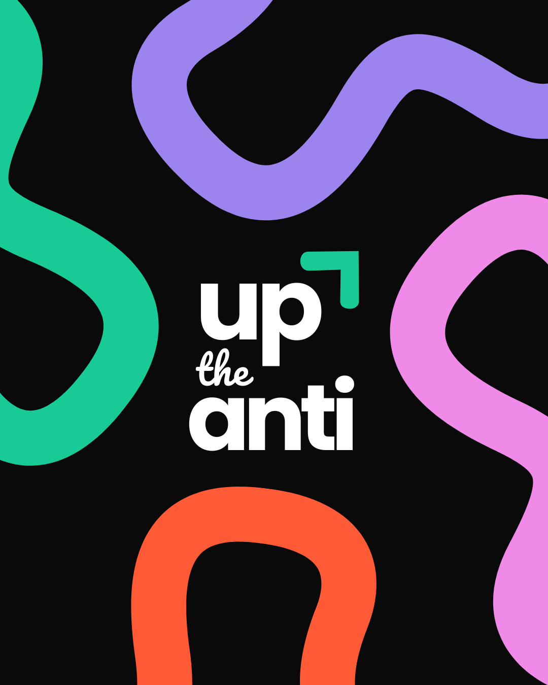
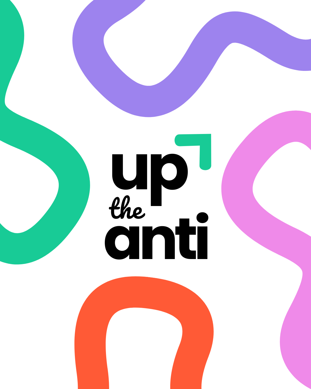
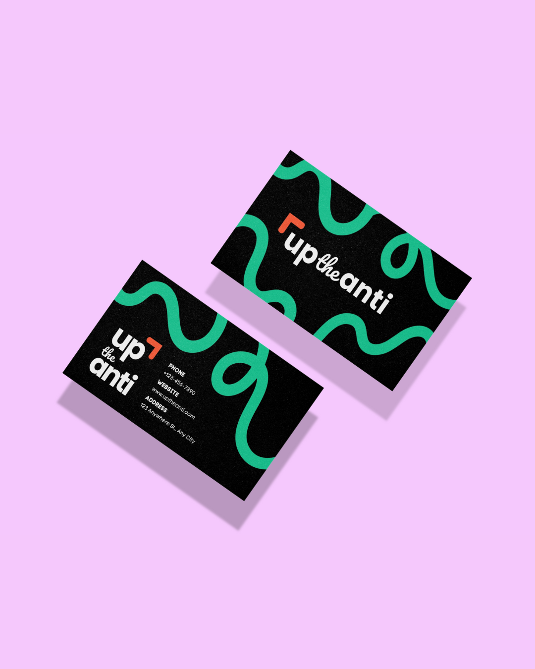
Confident, elevated, and full of attitude, the branding for Up The Anti reflects a bold vision for contemporary style.
With a name that challenges the norm, this identity leans into strength and minimalism, brought to life through impactful typography and a refined, timeless palette.
The overall mood is sharp and stylish, striking a balance between edgy and approachable to capture the spirit of those who dare to stand out.
-
To bring the bold and empowering energy of Up The Anti to life, I recommended embracing type-forward layouts, expressive colour blocks, and a playful use of space. These visual choices help reinforce the brand’s mission of uplifting and energising women through movement and mindset.
I also suggested carrying the hand-lettered logo style across future apparel, signage, and social media to maintain consistency and impact. The tone should remain confident and dynamic, encouraging the community to take up space, both visually and energetically.
-
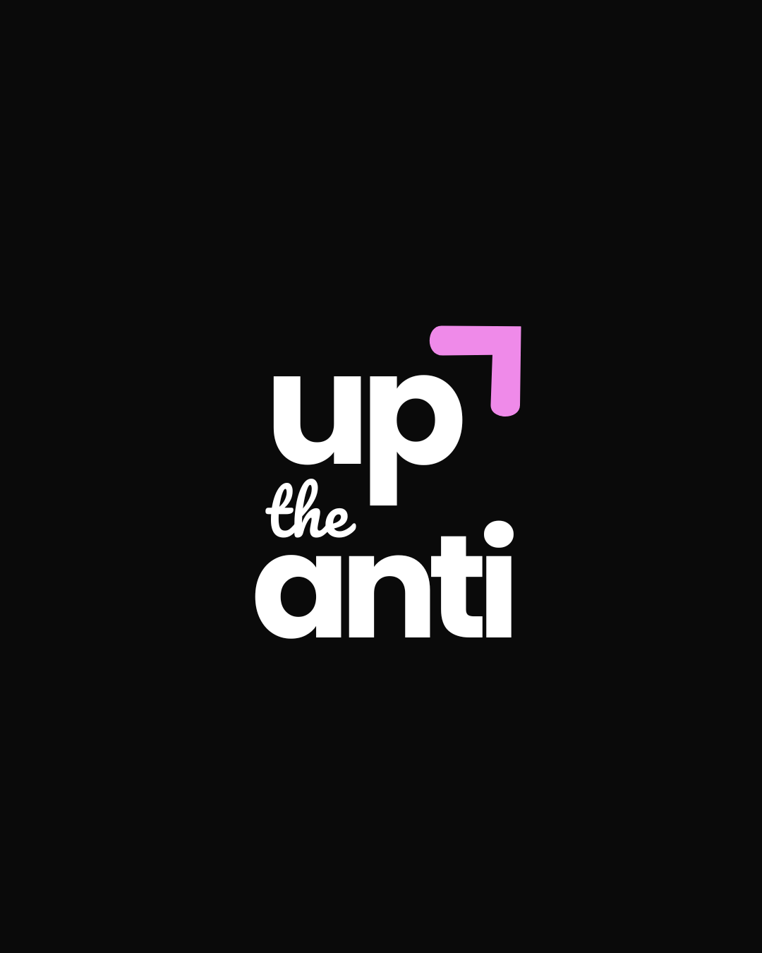
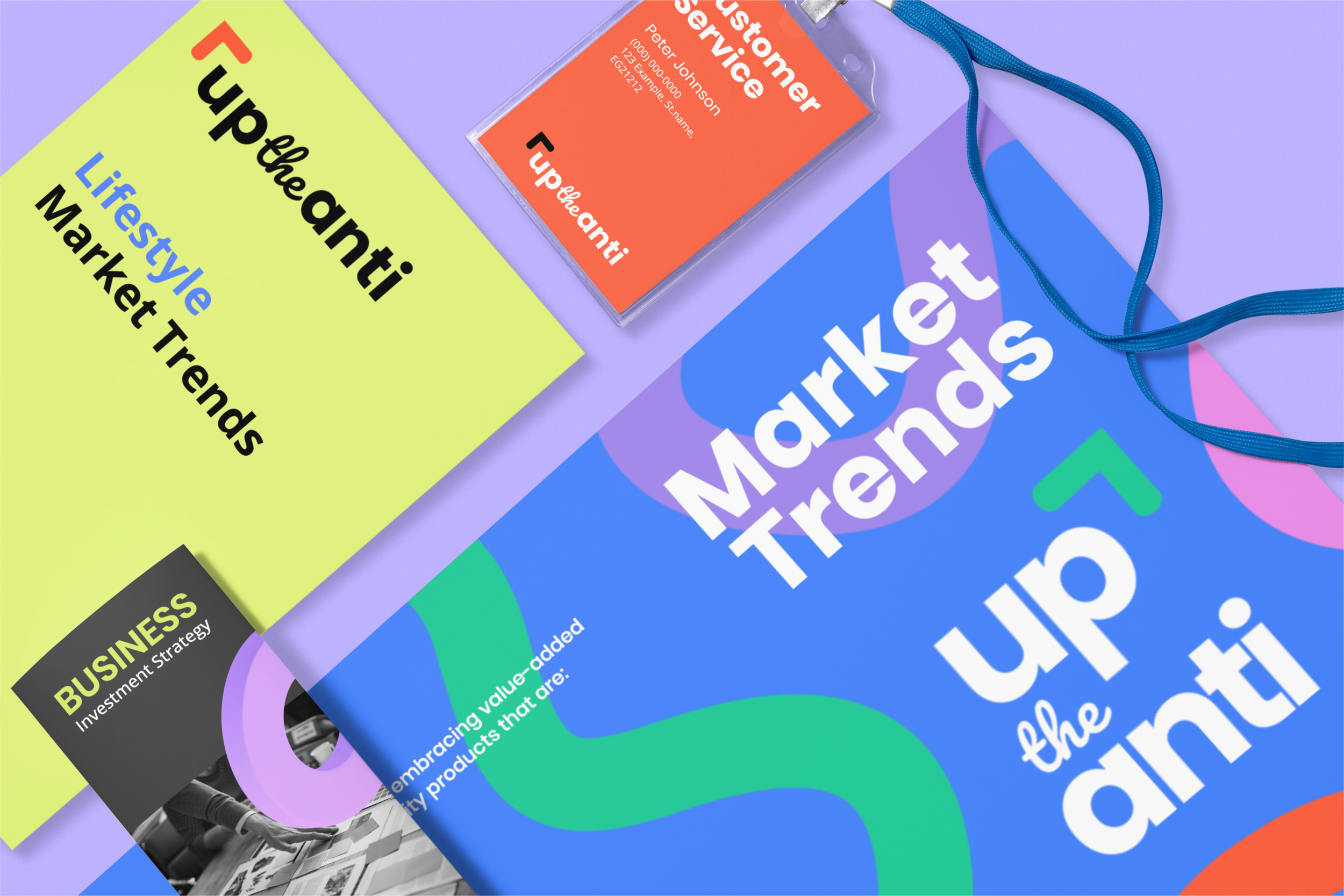
This project was completed under the Mini Branding Package, which included a custom primary logo and a secondary logo.
A bespoke colour palette and curated type selection were developed to reflect the bold, rebellious spirit of the brand. The logo suite was crafted with versatility in mind, ensuring strong presence across both digital and physical touchpoints.
Final export-ready logo files were delivered in multiple formats, ready to use across web, print, and social platforms.
-
This Mini Package did not include an icon logo, social media templates, website design, brand guidelines, or a full packaging suite.
No illustrated icon set or application mockups were part of the original scope. While all logo files were delivered ready for use, their application across platforms like Instagram or print collateral was not included. However, these items can be added as optional extras for future brand needs.