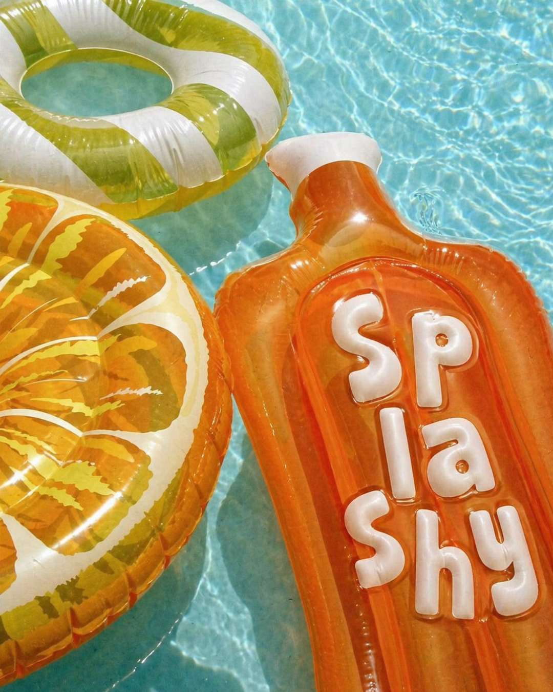
Splashy
-
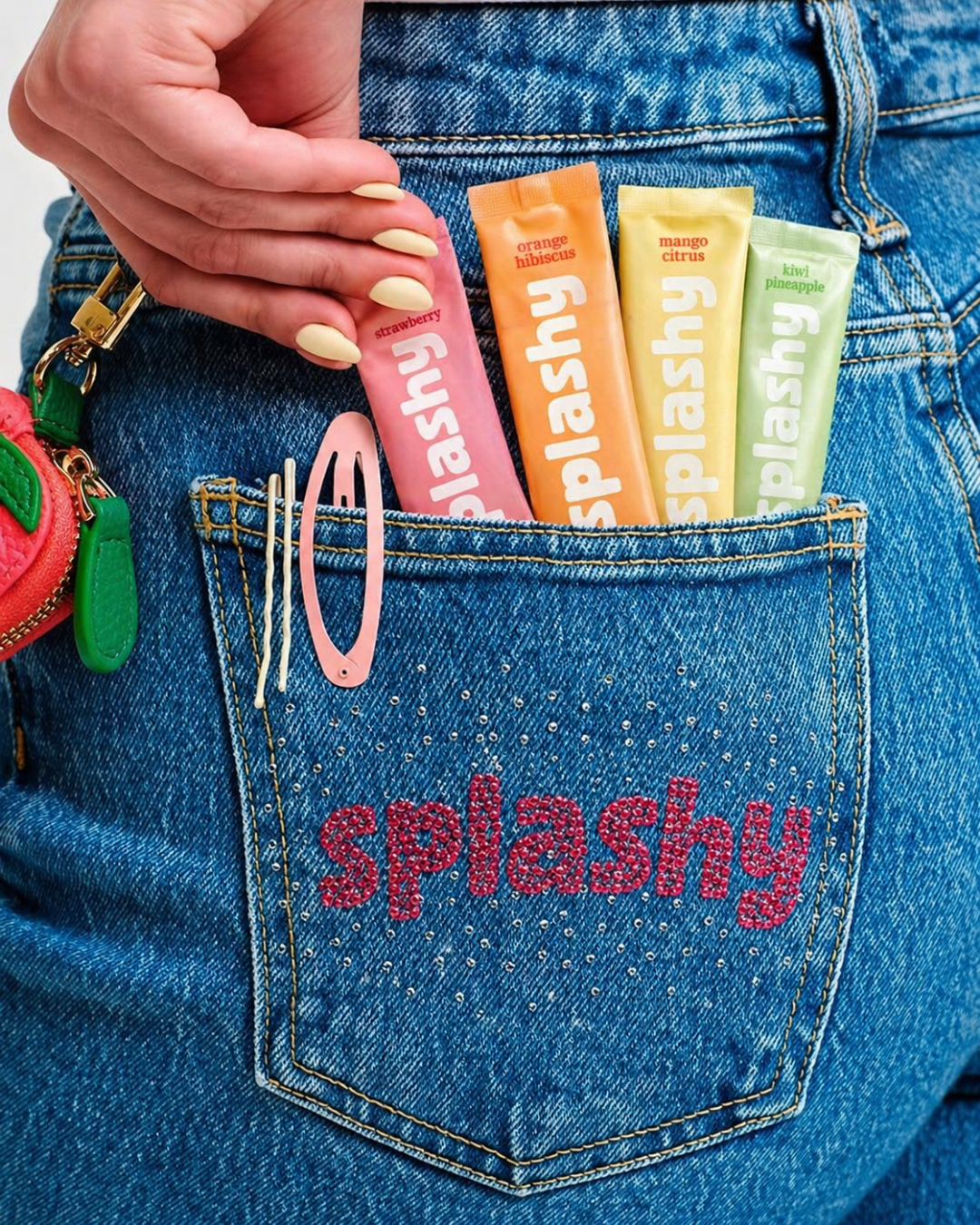
Playful, bold, and full of energy, Splashy is designed to make hydration feel fun, not forced.
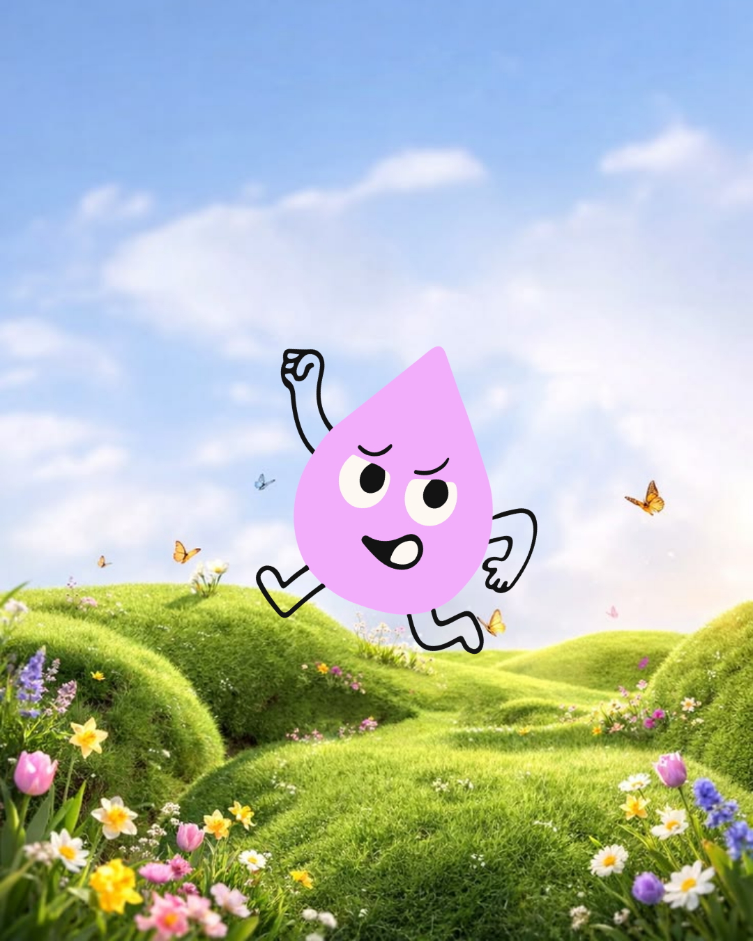
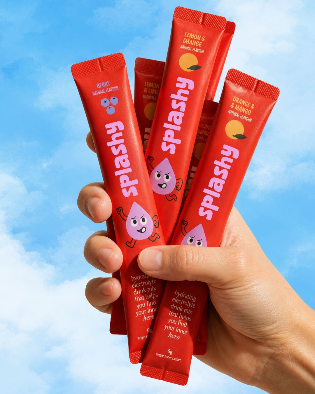
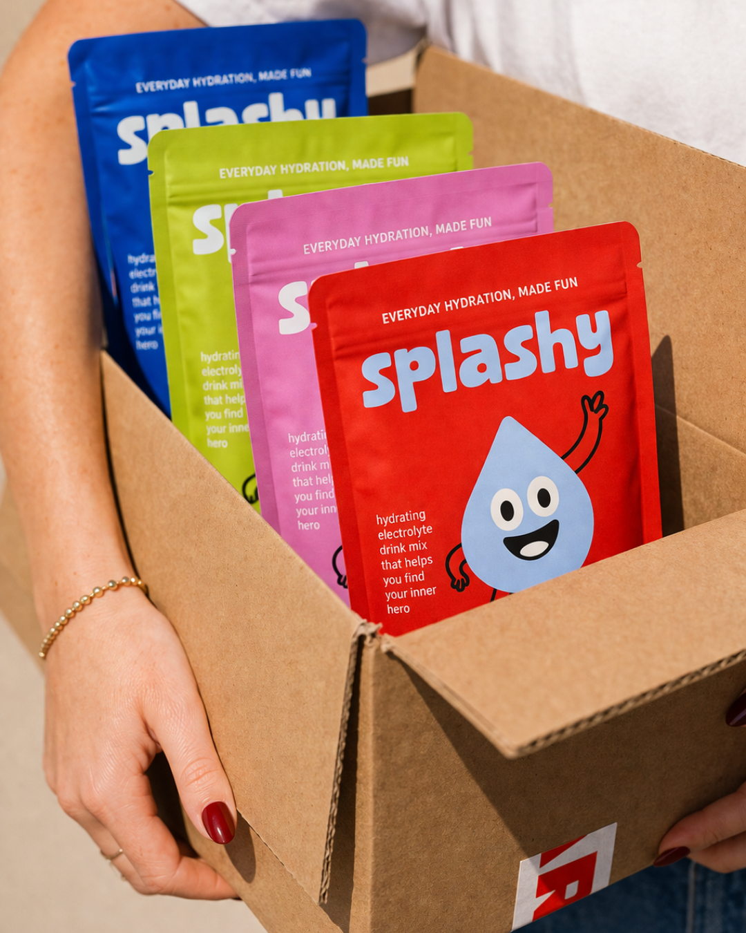
Built around bright colour blocking, soft rounded typography, and expressive illustrations, the brand captures a sense of movement, joy, and everyday ease. It speaks to kids through its vibrant personality, while still feeling clean and trustworthy for parents.
The overall identity balances fun and function, turning a daily habit into something exciting, approachable, and full of life.
-
To strengthen the brand’s impact across all touchpoints, I recommended leaning into the bold colour-blocking system to clearly differentiate flavours while maintaining strong shelf presence.
The playful illustration style can be expanded across packaging and digital to build recognition and create a cohesive, fun brand world around the product.
I also advised maintaining consistency in typography and layout across all formats to ensure the brand feels clear, confident, and instantly recognisable, both online and in retail environments.
-
This project was completed under the Essentials Branding Package, which included a custom main logo, secondary logo, and icon mark.
A bold and vibrant colour palette, typography system, and a set of playful, hand-drawn illustrations were developed to reflect the brand’s fun, energetic personality.
Final brand guidelines and all export-ready files were delivered, providing a cohesive visual system ready to be applied across packaging, digital, and future brand touchpoints.
-
This package did not include social media templates, website design, or a full packaging design system.
While logos, colours, typography, and illustrations were provided, their full application across packaging formats, marketing assets, or digital platforms was not part of the original scope.
These elements can be developed as additional extensions to further build out the brand across future touchpoints.