TWO A.M.
-
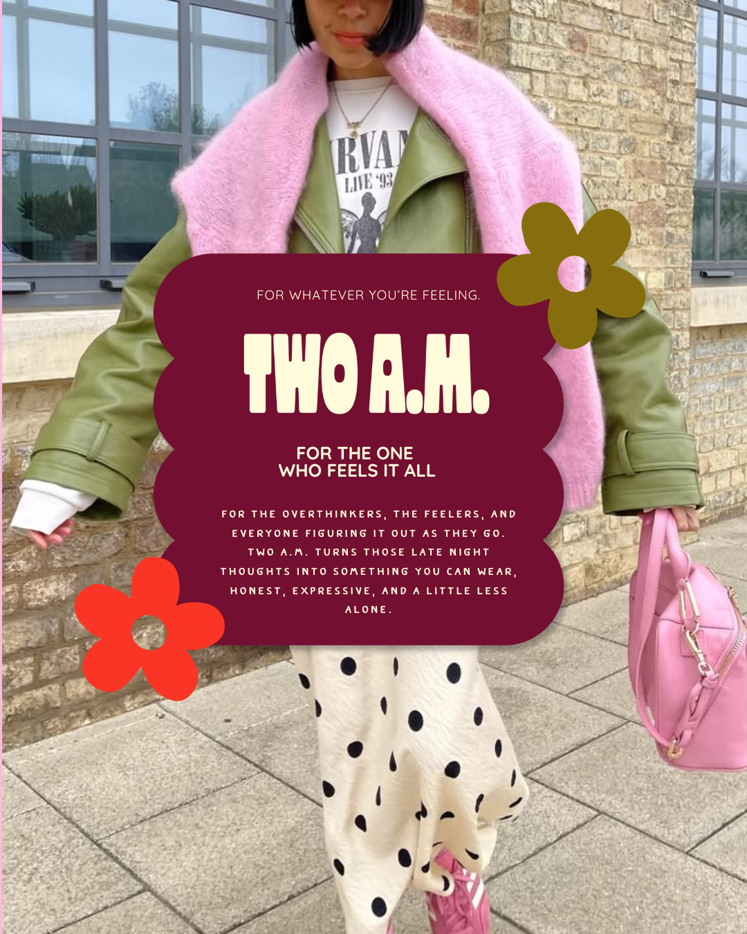
Warm, playful and a little unexpected, TWO A.M. is an emotionally expressive streetwear brand built for the girls whose minds are still wide awake at 2-something in the morning.
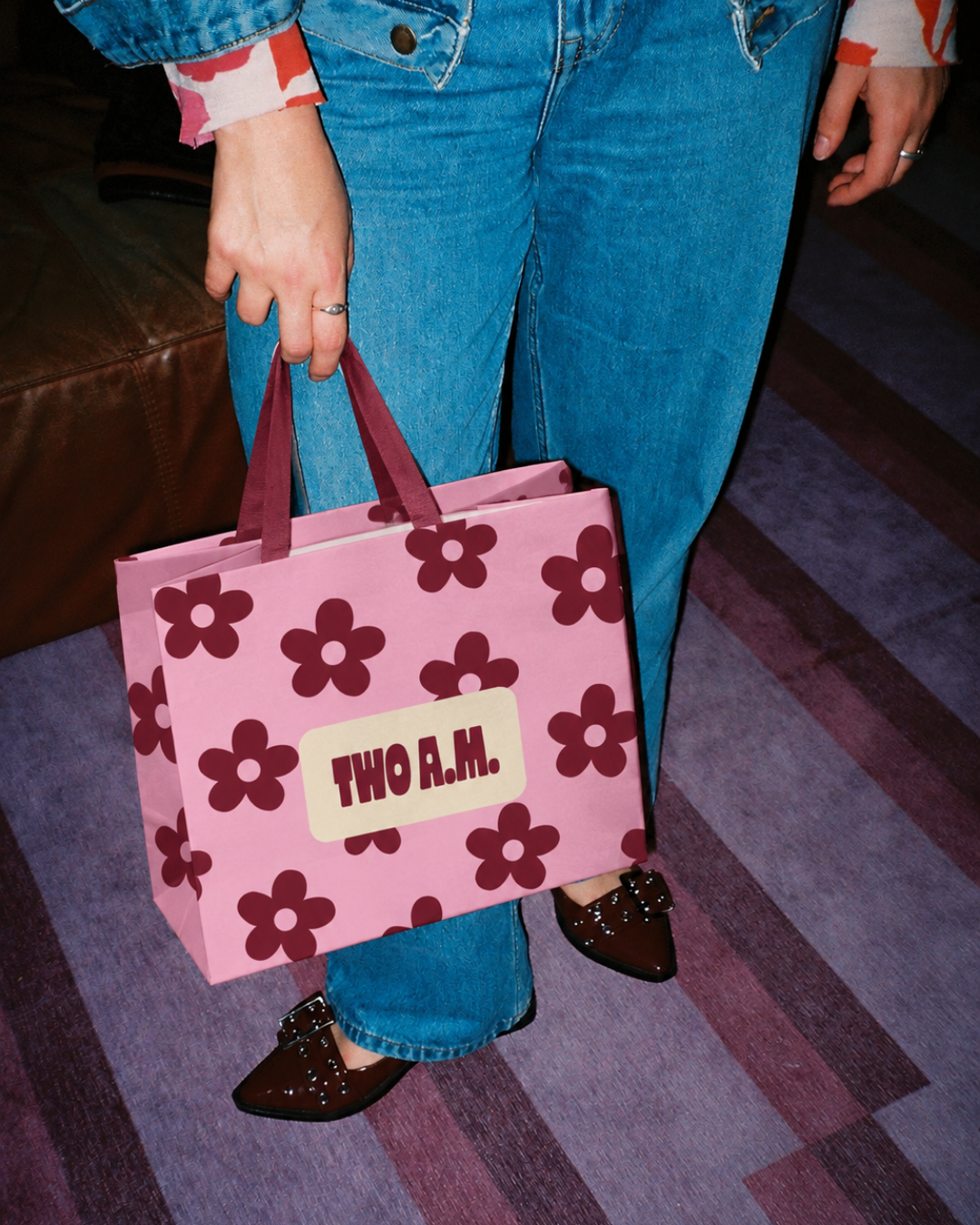
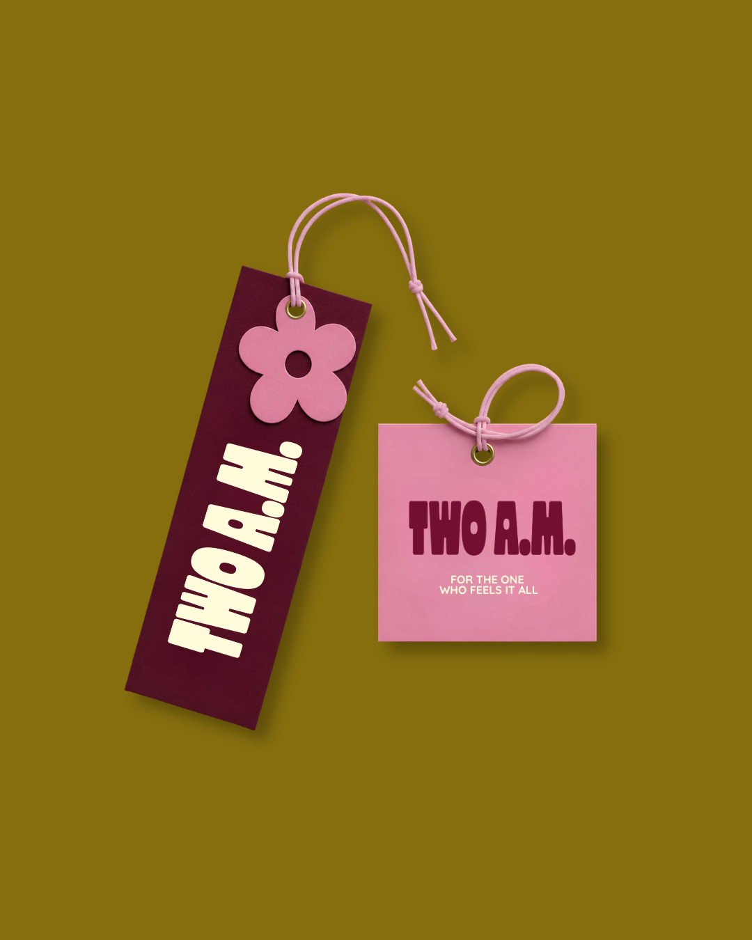
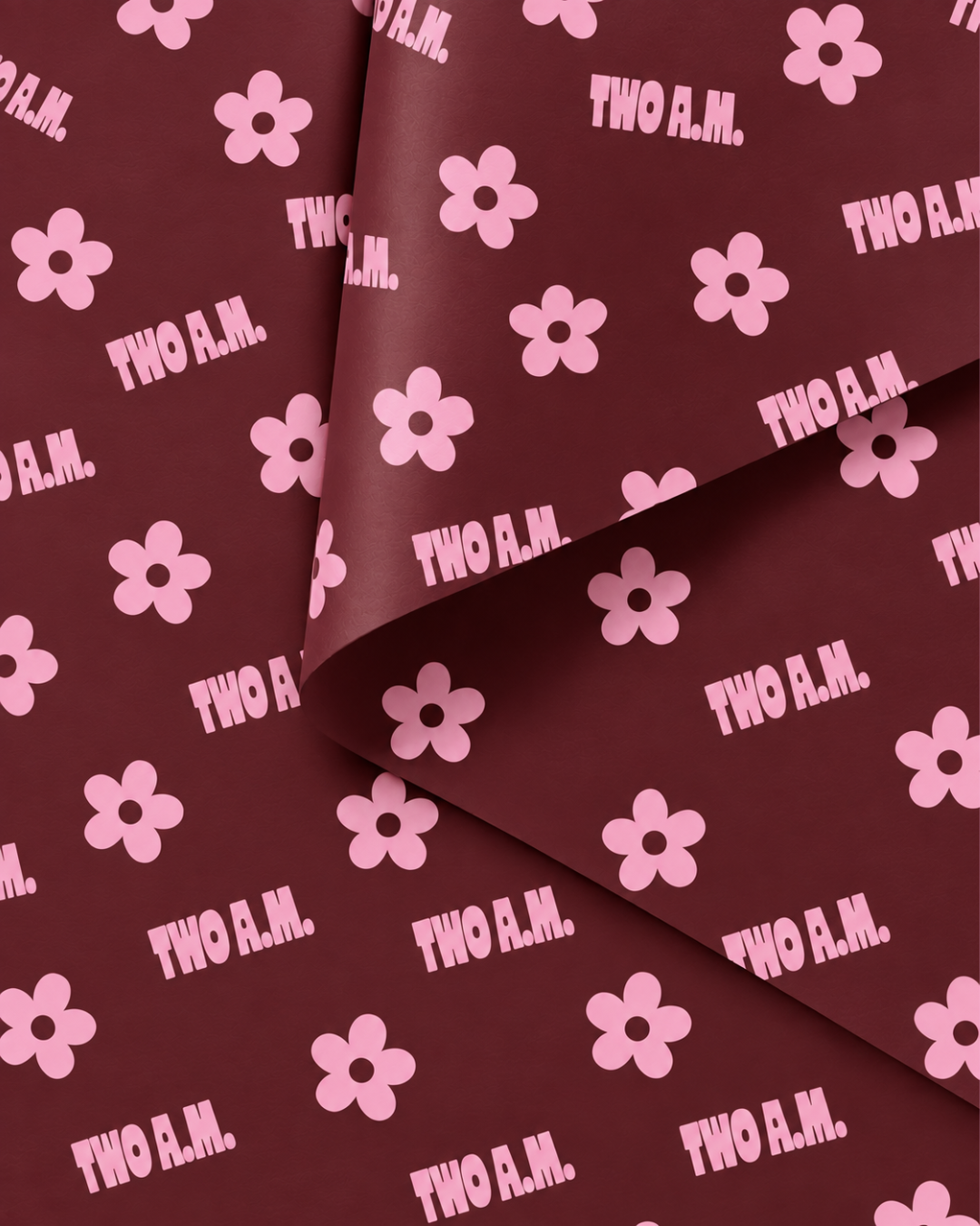
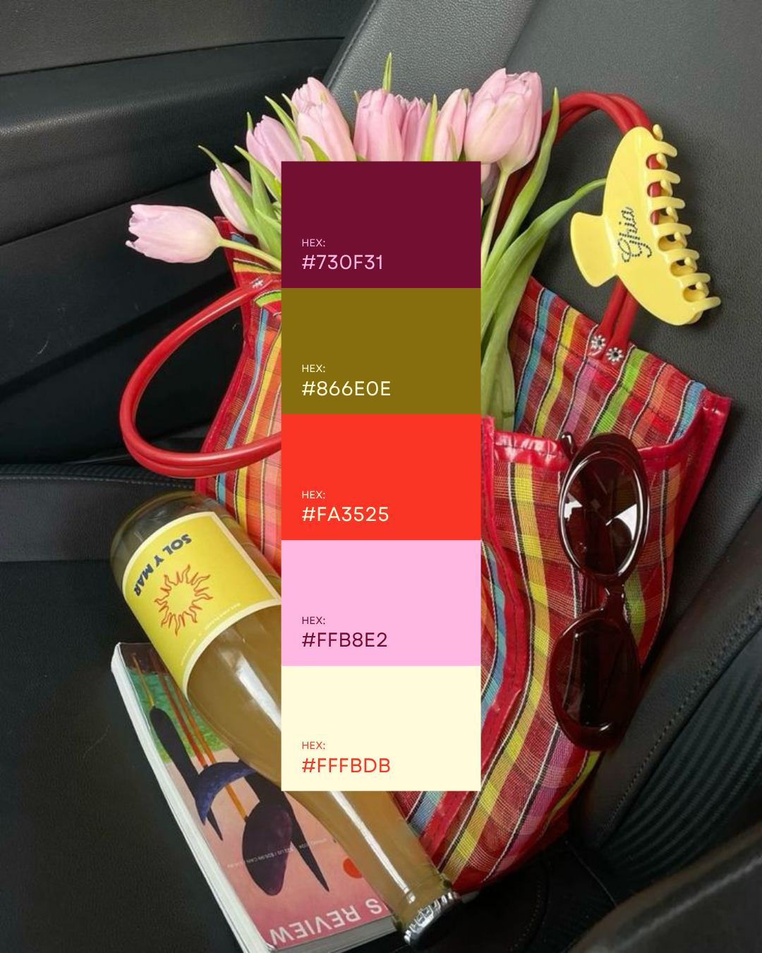
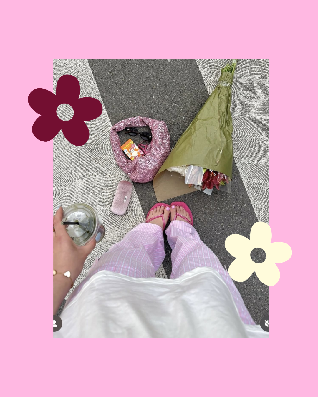
The identity balances two sides of the brand: bold, cheeky and slightly chaotic on the surface, with something much softer and more reassuring underneath. A retro-modern visual world of pink, burgundy and cream, characterful typography and playful graphics gives the brand personality without losing the premium feel of the clothing.
-
The goal was to create an identity strong enough to be recognised beyond a single collection. Rather than making the branding revolve entirely around Volume 1: Emotional Chaos, I recommended keeping the core identity flexible so future drops can explore different emotions while always feeling unmistakably TWO A.M.
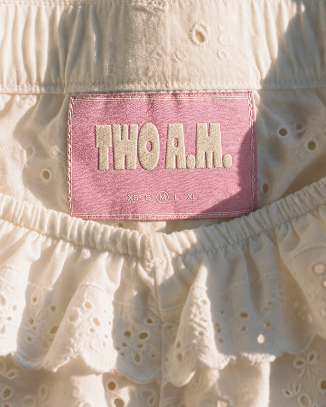
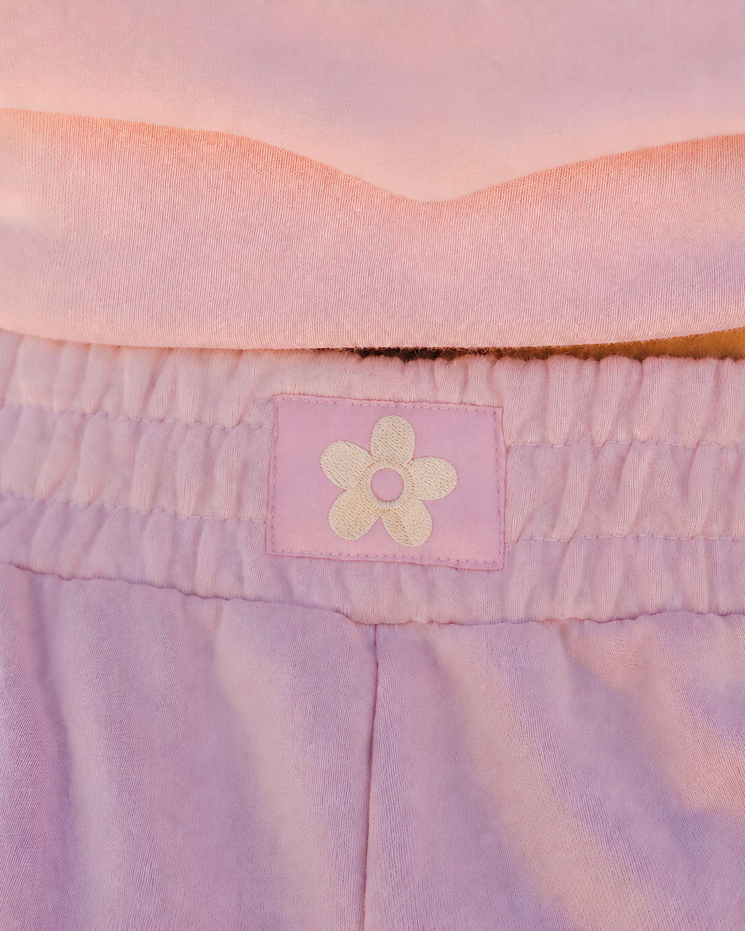
The primary wordmark creates that consistent foundation, while the secondary marks, flower emblem, colour combinations and graphic treatments give the brand room to feel different across garments, labels, packaging and campaigns. This allows the visual world to evolve alongside each collection without losing its personality or recognition.
-
The project combined a Mini Branding Package + Apparel Design Package, creating both the foundation of the TWO A.M. identity and its first collection of wearable applications.
Branding included two creative directions, primary and secondary logos, a font system, custom colour palette, brand guideline sheet and two rounds of revisions. The apparel stage included three custom T-shirt graphics, two sweatshirt/hoodie designs, two typography-based cap designs, colour selection, two rounds of revisions and print-ready production files.
Together, the system was designed to translate naturally from the brand itself into the clothes, where typography, graphics and messaging become part of the storytelling.
-
As a Mini Branding + Apparel project, this package did not include a full brand strategy, extensive brand guidelines, social media templates, website design, packaging design or ongoing collection development beyond the agreed apparel pieces.
Editable source files and commercial font licences were also outside the standard package, with source files available separately upon request and any required font licences purchased directly by the client.
The final identity instead provides TWO A.M. with a strong, flexible foundation that can grow into future collections, campaigns, packaging and digital applications as the brand evolves.