Cafe 1812
-
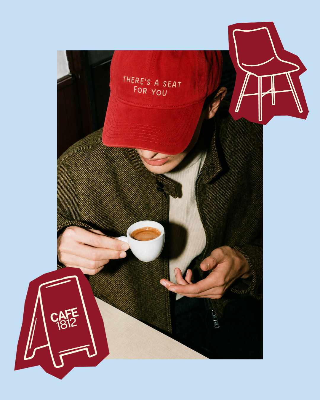
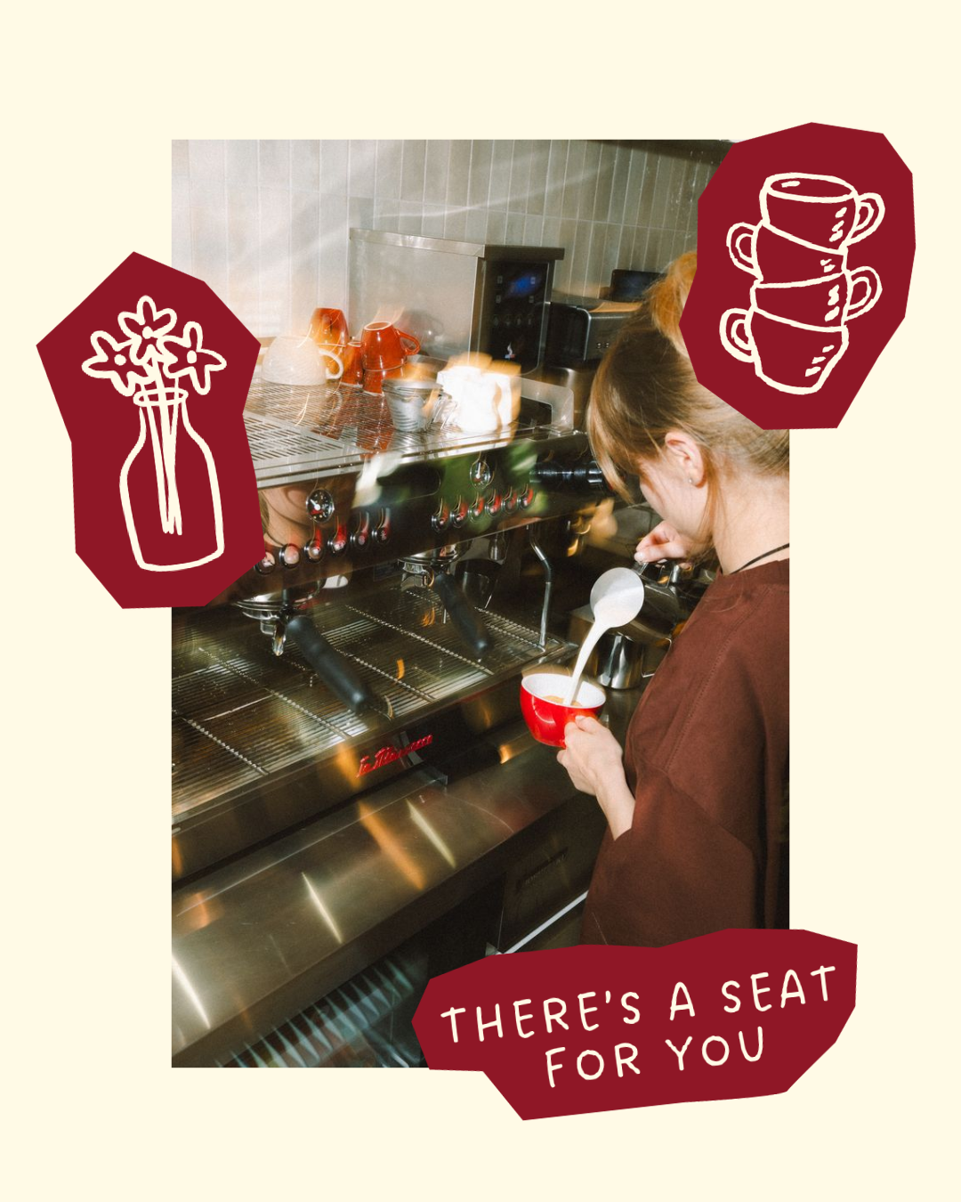
Timeless, welcoming, and community-focused, the branding for Café 1812 was created to reflect more than a coffee shop, it represents a place where everyone has a seat at the table.
Inspired by the café's story of beginning in a small apartment and growing through genuine human connection, the identity balances bold simplicity with warmth, creating a brand that feels both elevated and approachable.
-
To preserve the heart of Café 1812 as the brand expands, I recommended building a flexible identity system that could grow from home café pop-ups into a future brick-and-mortar location.
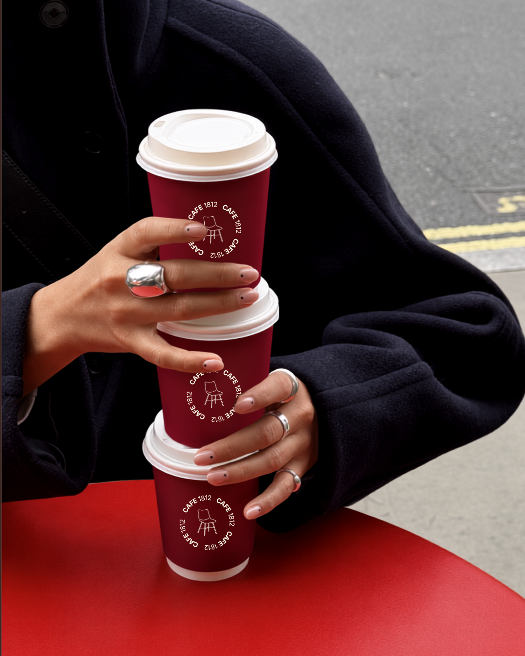
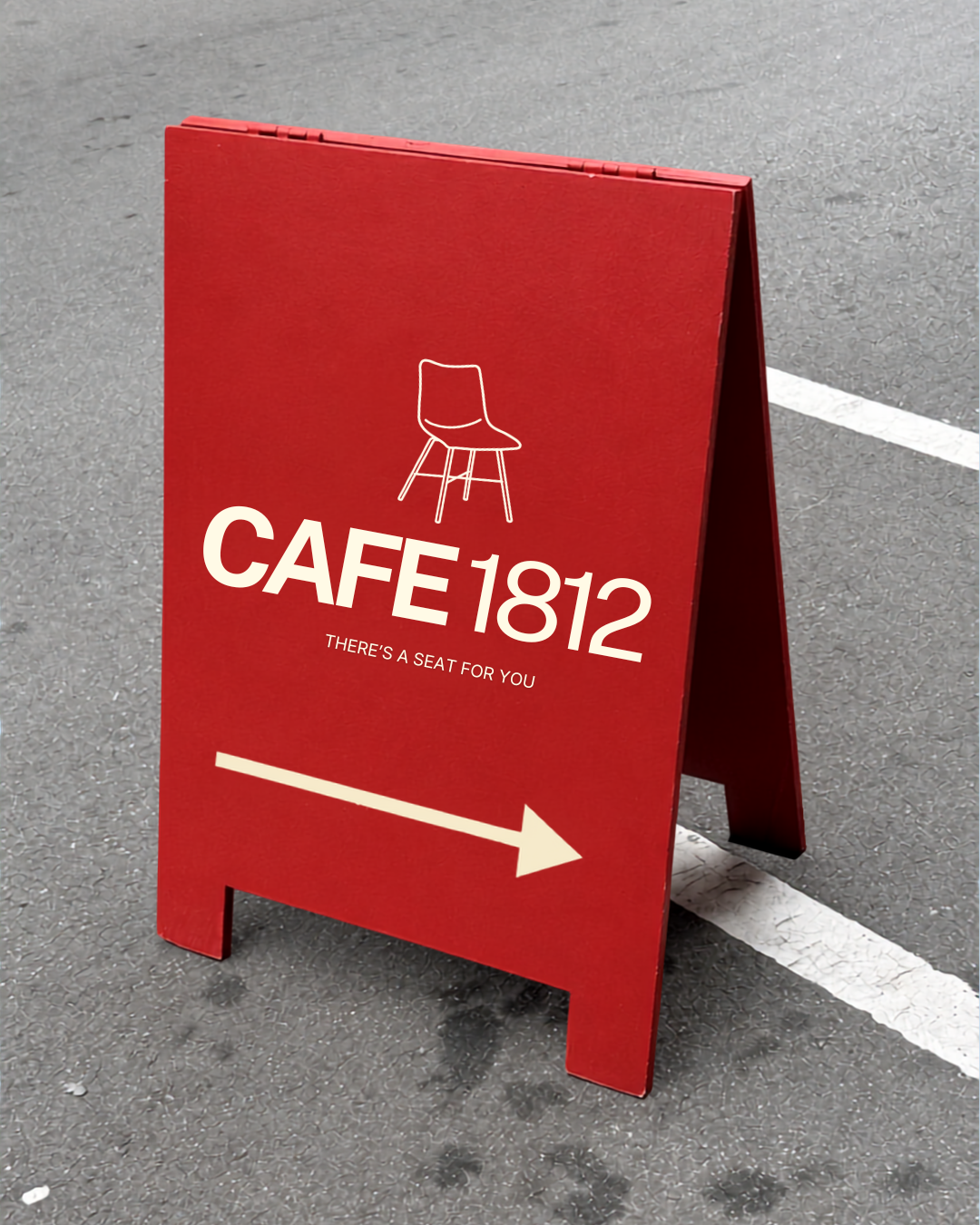
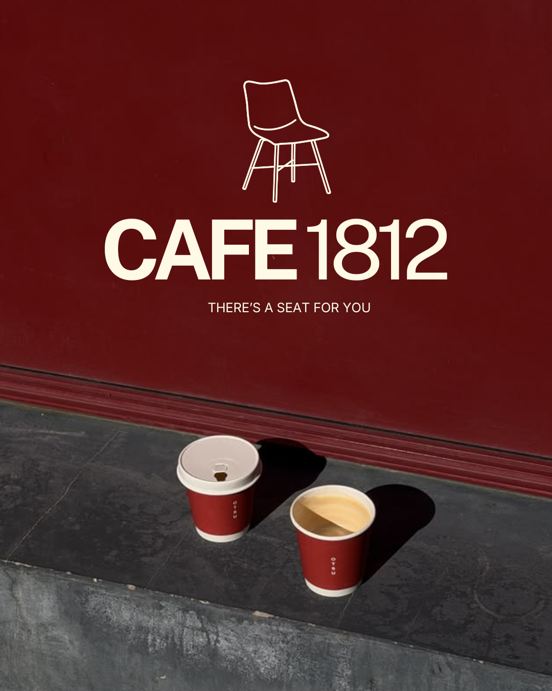
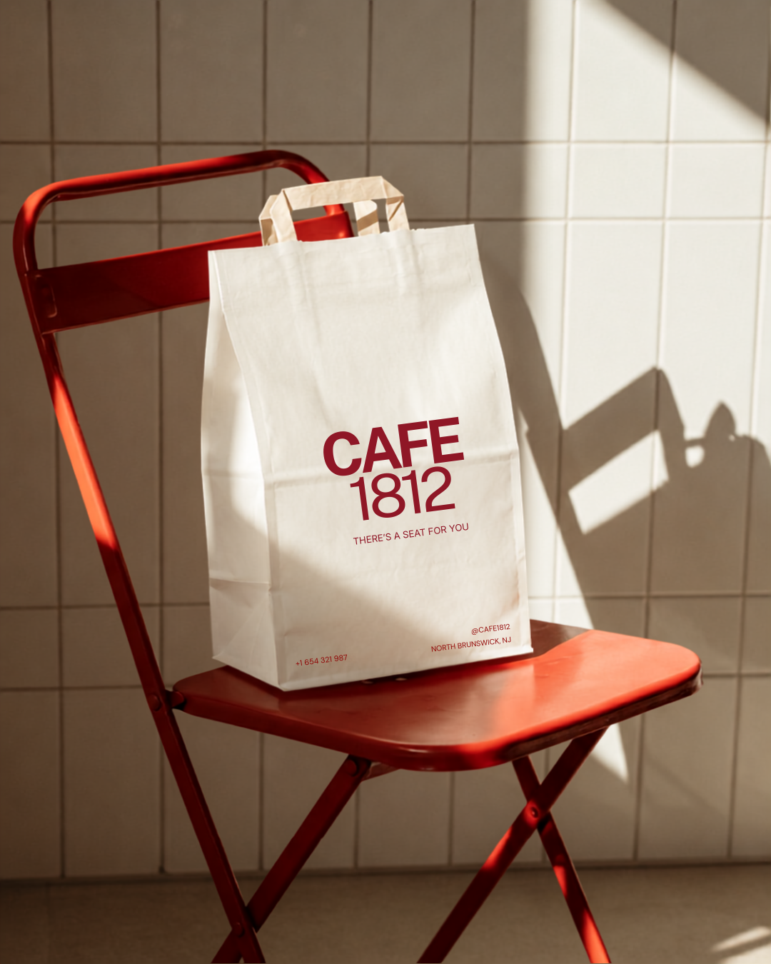
The table icon should remain the recognisable symbol across cups, merchandise, signage, packaging, and digital content, while the typography and colour palette provide a timeless foundation that allows seasonal campaigns and products to evolve without losing brand recognition.
-
This project was completed under the Essentials Branding Package, which included a custom primary logo, secondary logo, icon suite, colour palette, typography system, and full brand guidelines.
The project also included custom brand illustrations and visual elements to build a flexible identity system that can be applied consistently across packaging, merchandise, signage, social media, and future café experiences.
All final assets and export-ready files were delivered to support the brand's growth from home café to future brick-and-mortar.
-
This package did not include website design, social media templates, packaging production files, or marketing collateral beyond the branding scope.
While the Essentials Package provides a complete visual identity, additional deliverables such as menu systems, signage design, packaging artwork, merchandise collections, and website design can be developed as the business continues to grow into its long-term vision.