Cayetana Cheesecake
-
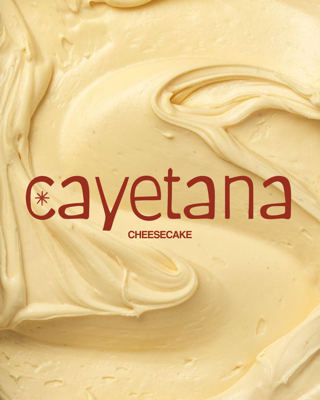
Sophisticated yet soulful, the branding for Cayetana Cheesecake captures the essence of a modern artisanal bakery, one that honors tradition while embracing contemporary elegance.
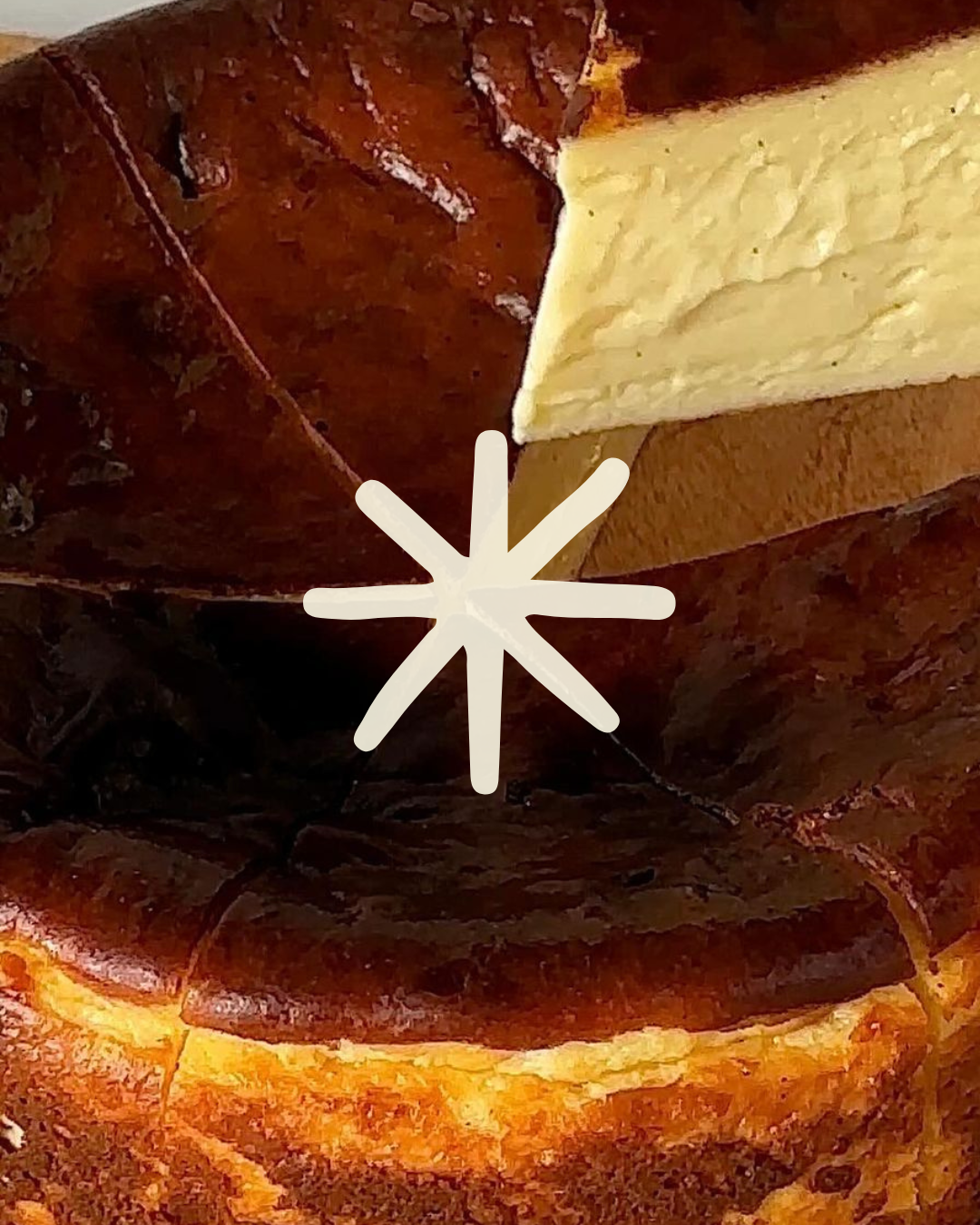
The identity evokes warmth and craftsmanship through its organic shapes, creamy hues, and subtly imperfect details. Each element is thoughtfully designed to mirror the refined indulgence of Cayetana’s cheesecakes: handmade, elevated, and full of personality.
This branding reflects a brand that’s both approachable and refined, a celebration of flavour, heritage, and slow moments shared around something sweet.
-
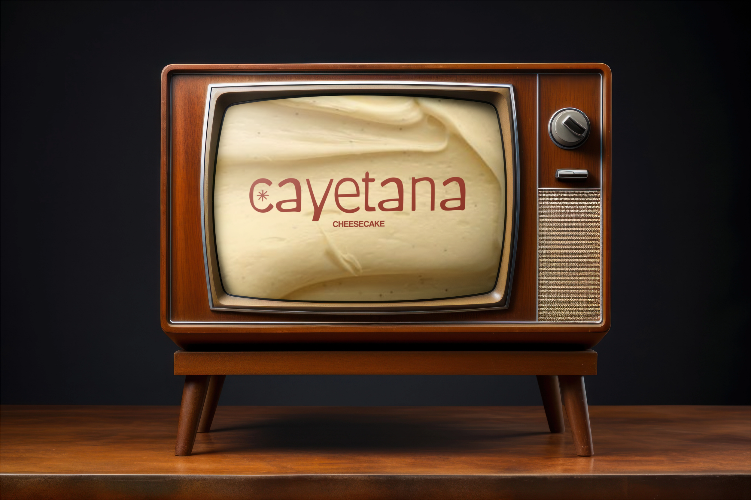
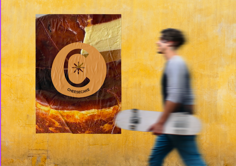
To preserve the elegant and artisanal essence of the Cayetana brand, I recommended expanding and consistently applying the visual identity across all touchpoints. The softly serifed wordmark, paired with the refined cheesecake-inspired asterisk, forms a distinct and flexible logo system that should remain central to all communication materials.
The warm, creamy colour palette and textural overlays were carefully curated to evoke the feeling of indulgent, handmade desserts. I suggested continuing this sensory language into social graphics, menus, and packaging, using subtle gradients, grain, and soft lighting to reinforce the brand's tactile, heartfelt tone.
Typography choices play a key role in conveying Cayetana’s unique balance of sophistication and warmth. Maintaining the pairing of an editorial serif with a modern sans serif helps keep the identity grounded yet approachable. I also advised using plenty of white space and clean layouts to let the branding breathe, reinforcing its sense of elevated simplicity.
To ensure coherence across platforms, I recommended applying the brand's visual codes, including the asterisk symbol, tonal palettes, and refined type hierarchy, throughout digital and physical touchpoints. This helps build immediate recognition and emotional connection while retaining the artisanal charm that sets Cayetana apart.
-
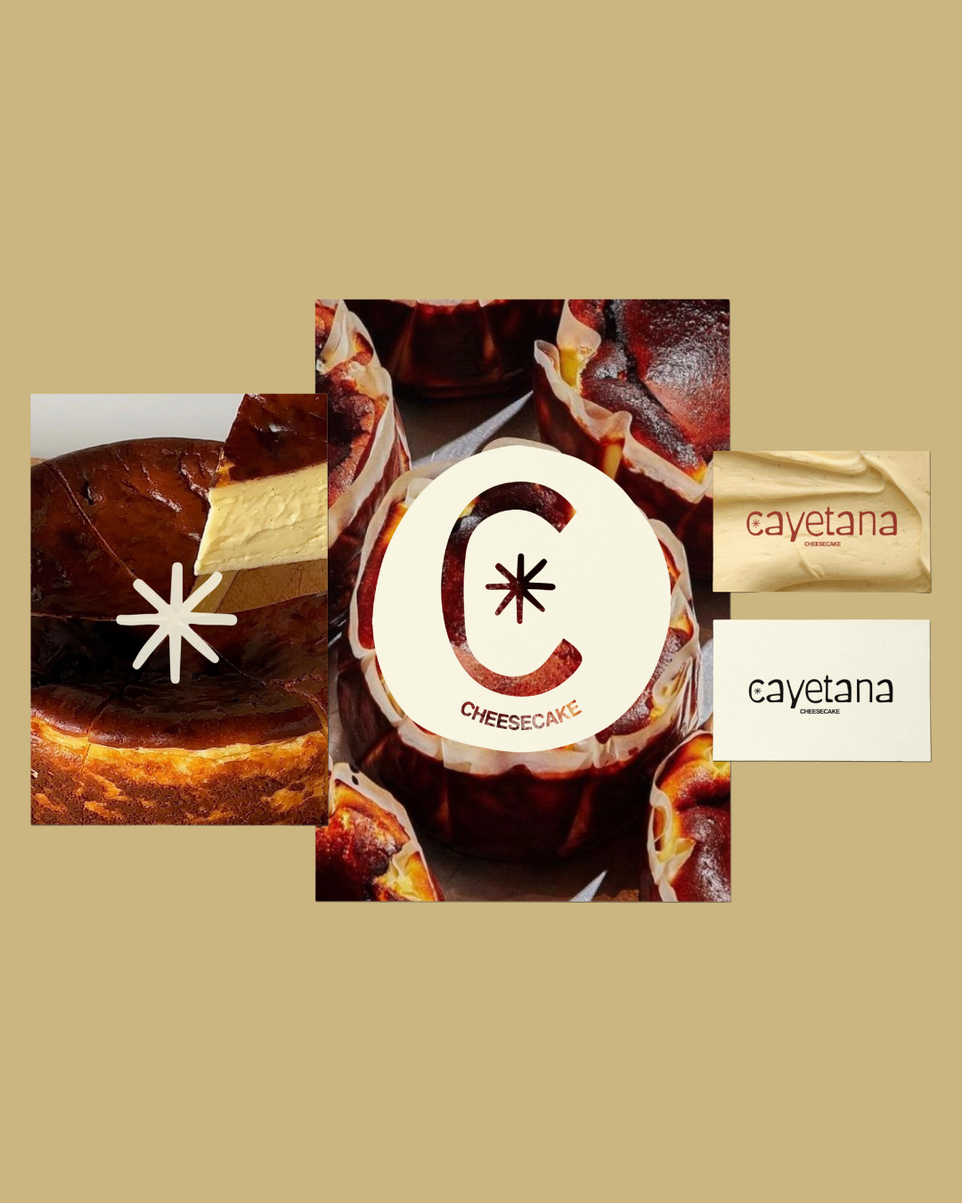
This project was completed under the Mini Branding Package, which included a custom main logo, a secondary logo variation, and a refined colour palette.
A distinctive typographic system was developed to convey Cayetana’s nostalgic yet refined tone, along with an abstract icon symbolising a cheesecake slice, designed to serve as a brand mark for stickers, packaging, and online use.
The Mini Package focused on capturing the essence of the brand with elegant and minimal assets to give the business a strong visual identity, ready for early-stage application across Instagram and cake box packaging.
-
As this was a Mini Branding Package, it did not include deliverables such as a full brand guideline document, a set of five illustrated icons, social media templates, website design, or a comprehensive packaging suite.
While a logo system and core visual elements were developed and delivered (including colours, fonts, and illustration), their application across platforms, such as Instagram assets, printed materials beyond the cake card, or cohesive signage, was not part of the original scope.
However, these items can be added as optional extras in the future to extend the brand experience consistently across all touchpoints.