Frändén and Co.
-
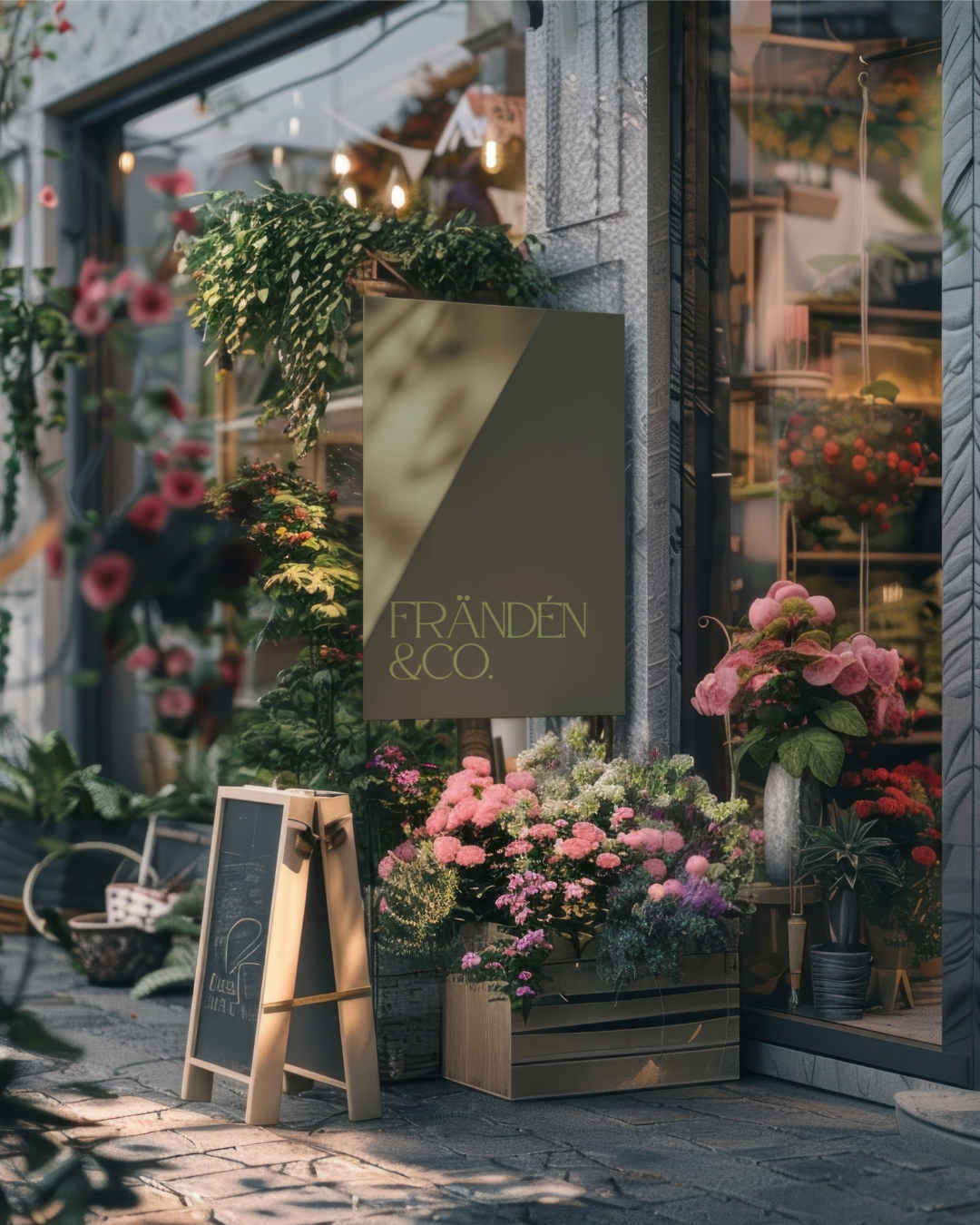
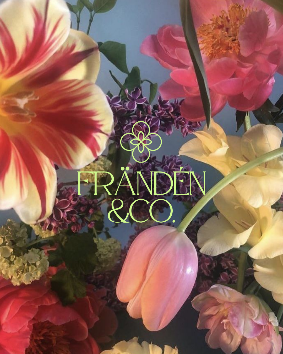
Poetic, refined, and soulfully modern, the branding for Frändén & Co. captures the elegance of fine floristry with a contemporary edge. The identity balances timeless sophistication with a creative spirit, designed to feel both elevated and approachable.
Drawing inspiration from soft botanicals, art nouveau forms, and a luminous colour palette, the brand blends sensitivity with strength. It honours natural beauty while creating a distinctive presence that feels bold yet graceful.
Every element is crafted to reflect the artistry behind Alishia’s floral creations and the emotional connections they bring, celebrating love, memory, and life’s most meaningful moments.
-
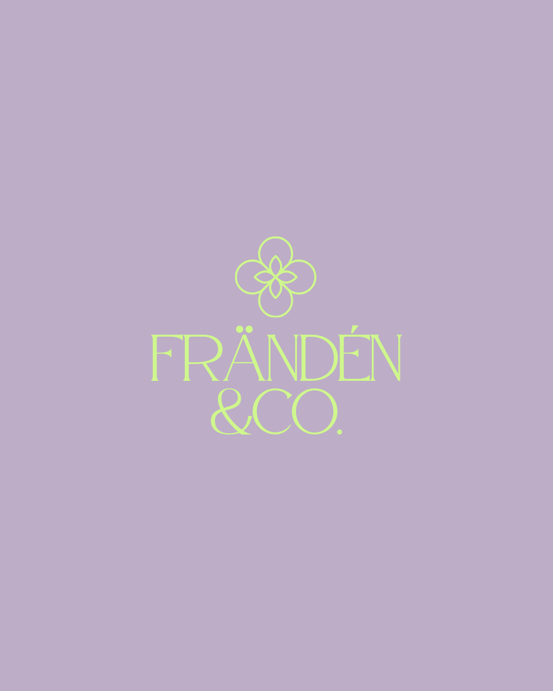
To ensure brand consistency and versatility, I recommended preparing a full suite of logo variations, including primary, secondary, and icon formats . This gives Alishia the flexibility to apply the identity seamlessly across both print and digital touchpoints.
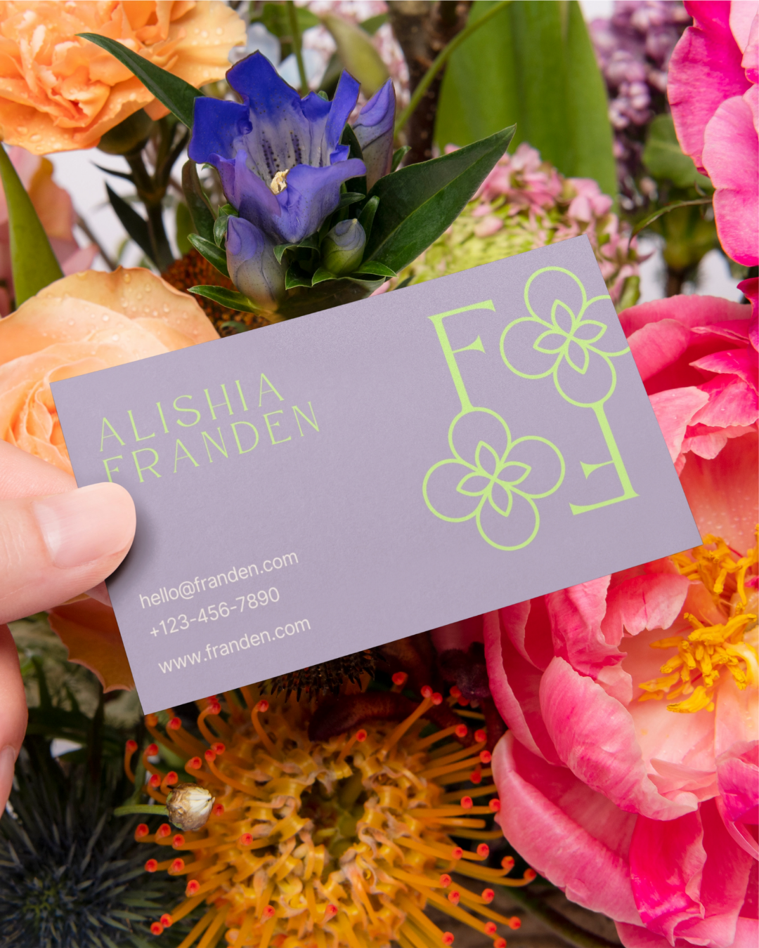
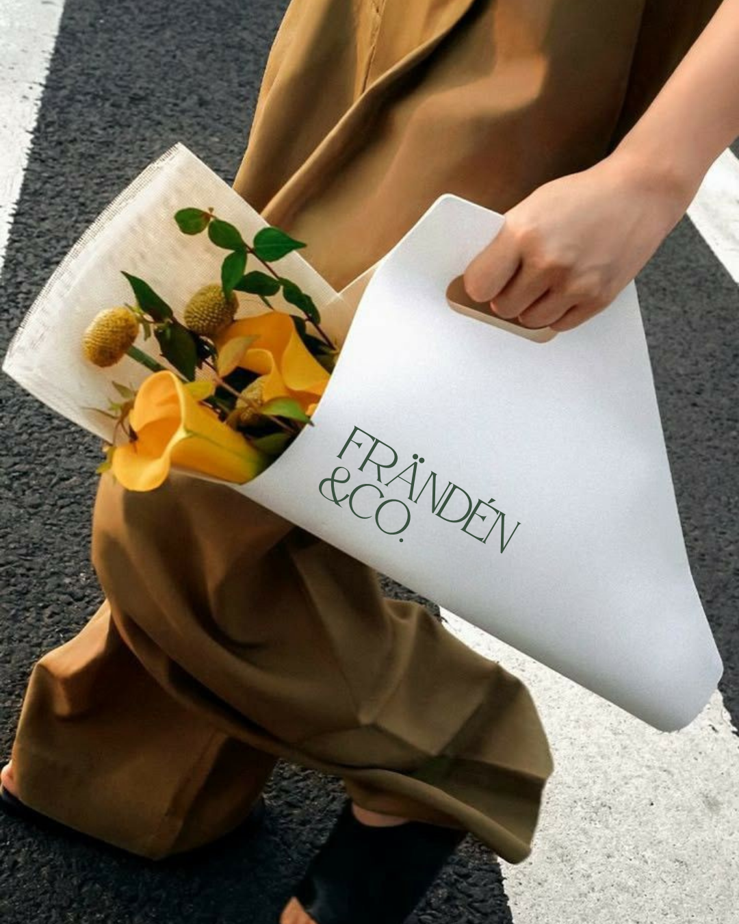
I also suggested extending the brand into print collateral such as business cards, thank-you cards, or swing tags, to strengthen the client experience. Incorporating the new typography system and colour palette into Canva templates was advised to make content creation easy and cohesive for Alishia as she builds her online presence.
Finally, I encouraged the use of the brand icon across social media profiles, packaging, and signage to create instant recognition and a strong, unified visual identity.
-
This project was completed under the Mini Branding Package, with the addition of a collateral print design.
It included a custom primary logo, secondary logo, and icon logo, all delivered in full colour variations, black, and white. A tailored colour palette and carefully chosen typography system were also developed to define the brand’s elegant yet contemporary identity.
Final brand guidelines and all export-ready files were provided, alongside the design of a print collateral item to extend the identity beyond digital touchpoints.
-
This package did not include social media templates, website design, illustrated icons or a full packaging suite.
While the logo suite, colour palette, and typography system were delivered, the application of these elements across social platforms or additional printed collateral beyond the one chosen item was not part of the original scope.
However, these items can always be added as optional extras in the future to expand and strengthen the brand’s presence.