The Flow & Flourish Practice
-
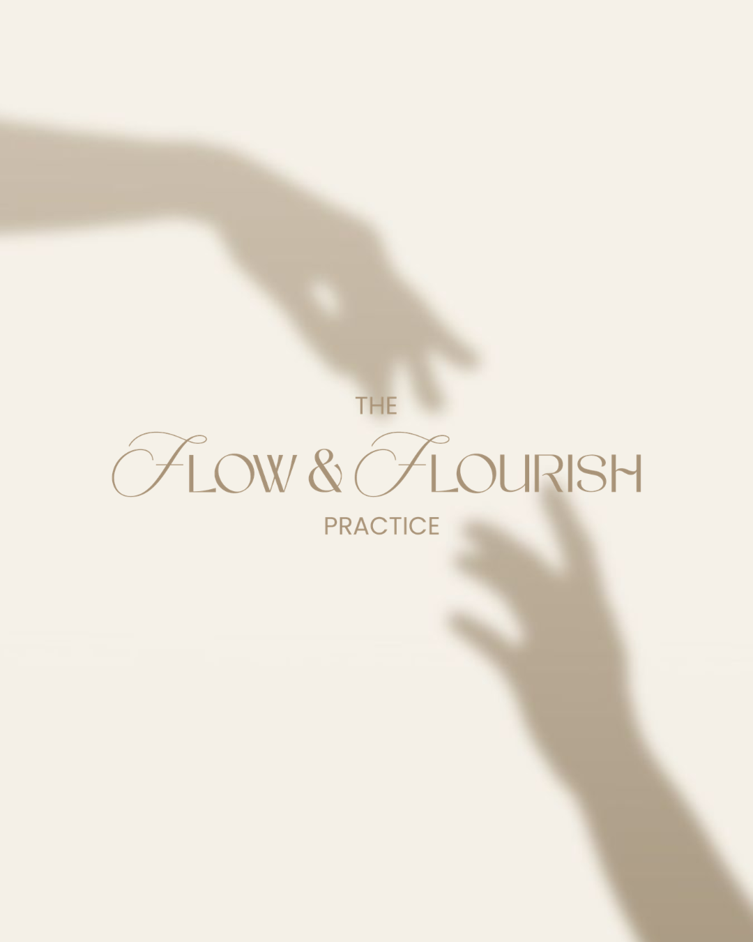
Gentle, reflective, and quietly uplifting, The Flow & Flourish Practice was created to feel like a safe space for growth, connection, and emotional wellbeing.
Inspired by the natural rhythm of reflection and personal development, the identity combines elegant typography, soft custom flourishes, and calming earthy tones to create a brand that feels both nurturing and professional.
Every element was thoughtfully designed to evoke trust, warmth, and the quiet confidence that allows children and families to flourish.
-
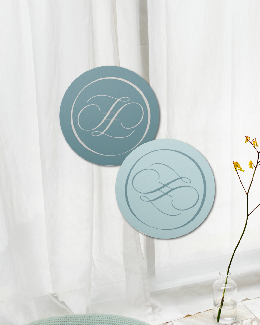
To strengthen the brand's distinctive identity, I recommended leading with the custom wordmark and monogram across all touchpoints to build strong brand recognition.
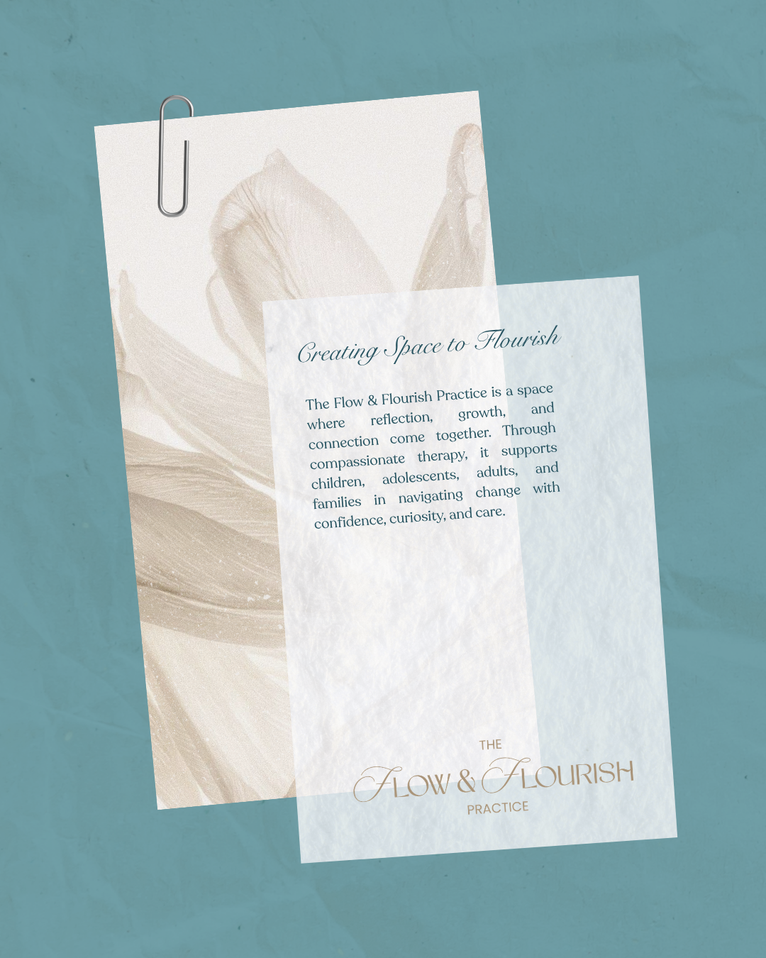
Using the soft colour palette, elegant typography, and refined flourishes consistently helps create a calm and welcoming experience while reinforcing the practice's thoughtful and nurturing approach.
As the brand grows, these visual elements can naturally extend into stationery, resources, social media, and environmental signage while maintaining a cohesive identity.
-
This project was completed under the Mini Branding Package, which included a custom primary logo, secondary logo, and monogram.
A carefully curated colour palette and typography system were developed alongside custom typographic refinements and handcrafted flourishes to create a unique, timeless identity.
All final logo files and export-ready assets were delivered, providing a cohesive visual foundation for the practice's launch.
-
As this project was completed under the Mini Branding Package, it did not include a full brand guidelines document, social media templates, website design, or a complete illustration suite.
While the core visual identity was established, additional brand assets, marketing materials, and future brand applications can be developed as the practice continues to grow.